
Personality and clarity
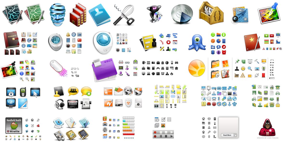
ABOUT AFTERGLOW DESIGN
For a number of years, I designed the interface elements and iconography for a large range of software firms.
THE PROBLEM
With any of these applications, their purpose was sometimes difficult to convey and the app also needed visual metaphors that were familiar to a large range of people.

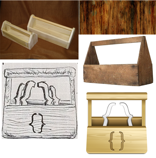
RESEARCH
For all of the iconography work, there are a set formula to producing icons. It always started with a dictionary to find the most widely accepted meaning for a term. This helped a lot of cultural biases to be neutered at the start..
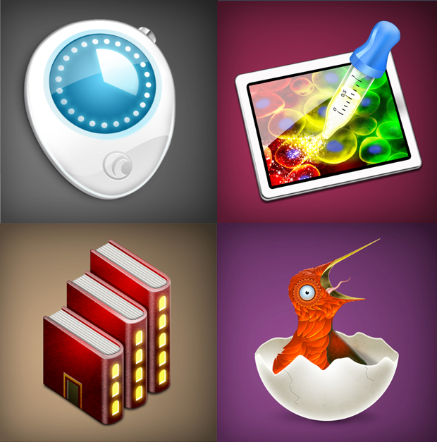
CONSIDERATIONS
For all of the iconography the items had to live alongside either a family of icons or other different applications. So a metaphor had to be clear and attractive but also be comfortable in particular environments.


OUTCOME
My iconography was showcased in a wide range of high profile Mac applications which eventually led to a role inside the Pro Applications department in Apple.